
The aim of this project was to redesign the outside packaging for three of the bar flavours from the brand 'Chocolate Arthouse'. The ideas for the packaging created also had be applied to other advertising materials and so a voucher and promotional video were also created.
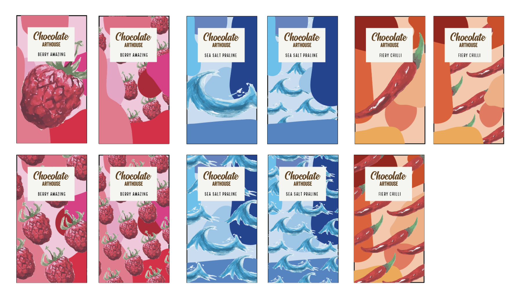
Chocolate Arthouse had recently rebranded when I started this project, but their new logo used a lot of colour and therefore would have clashed with the bright colours I had in mind for the packaging. I chose to use similar typefaces to create a monochrome, text logo which was more appropriate for the format of the packaging created.
This project was a real learning curve as I had never created any packaging before so a lot of new skills were learnt. The most difficult part was applying the same designs to the different elements of this project without making them feel exactly the same whilst still ensuring that they effectively worked well together. The process of this project can be seen in the images below. I began with a lot of different ideas such as typographic packaging, more illustrative, and combining shapes and watercolour illustrations. The end result used the idea of paint strokes to link to the 'arthouse' element of the brand but these were refined and drawn digitally to create a busy and exciting main bar package. A belly band was then created to sit on top of this and aid the user journey. It is also used to provide the important information needed on food packaging.
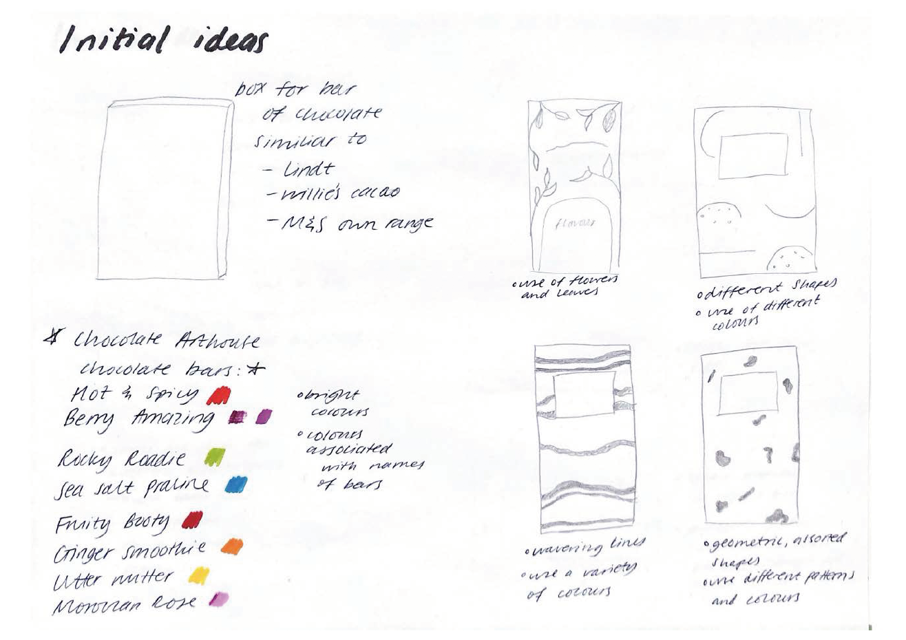
Sketching design ideas
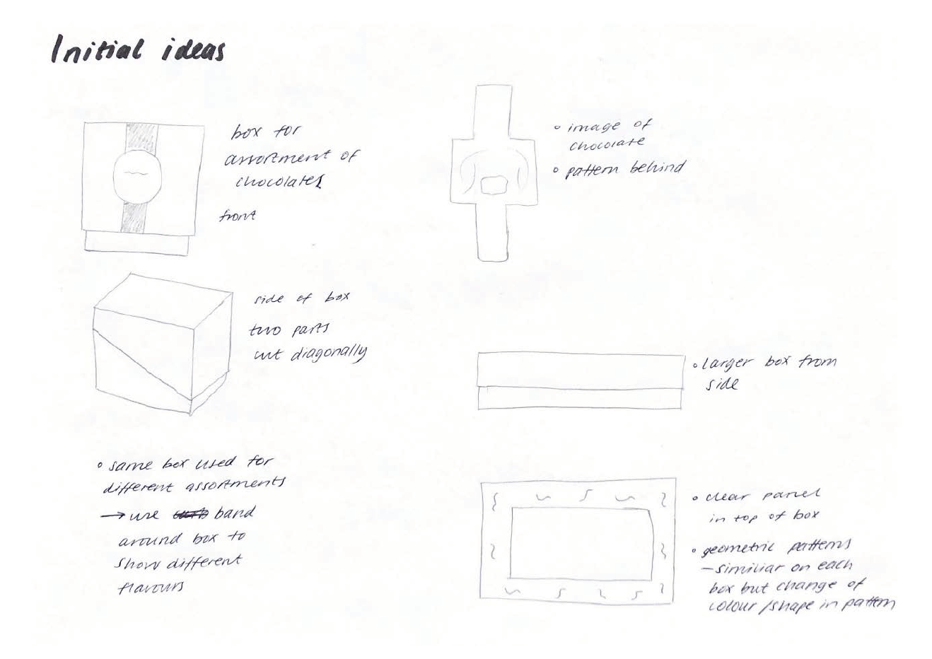
Sketching packaging ideas
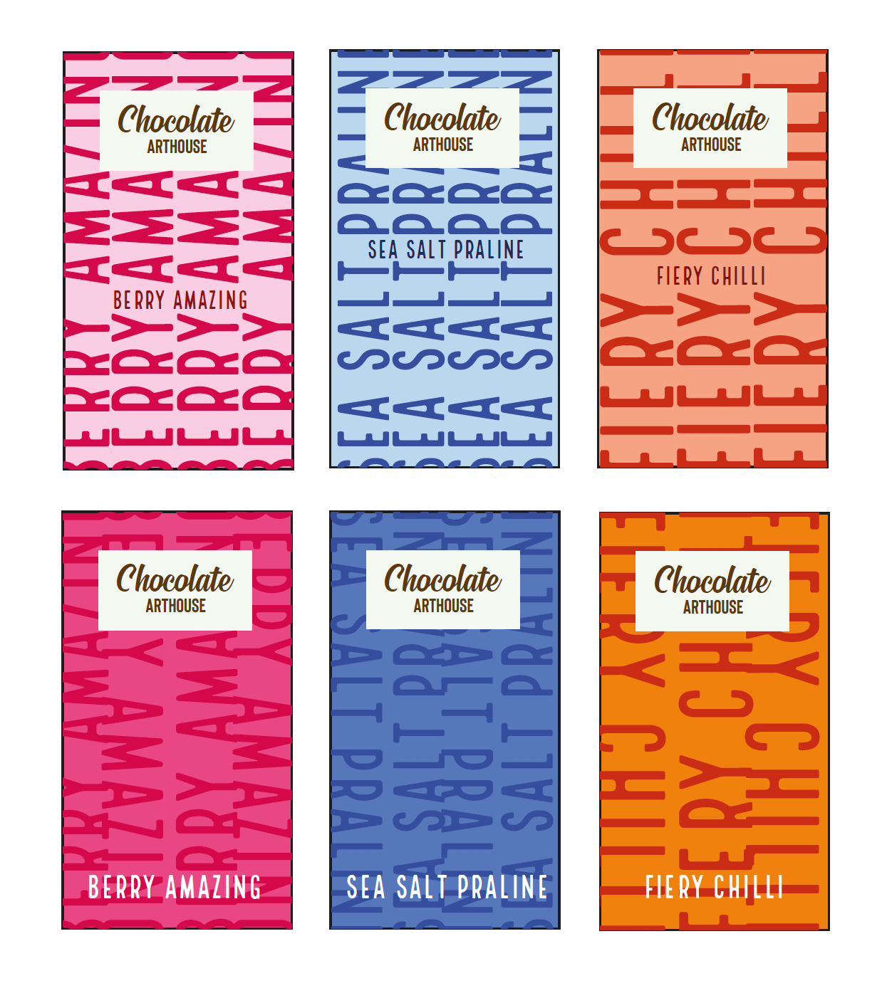
Typographic design ideas
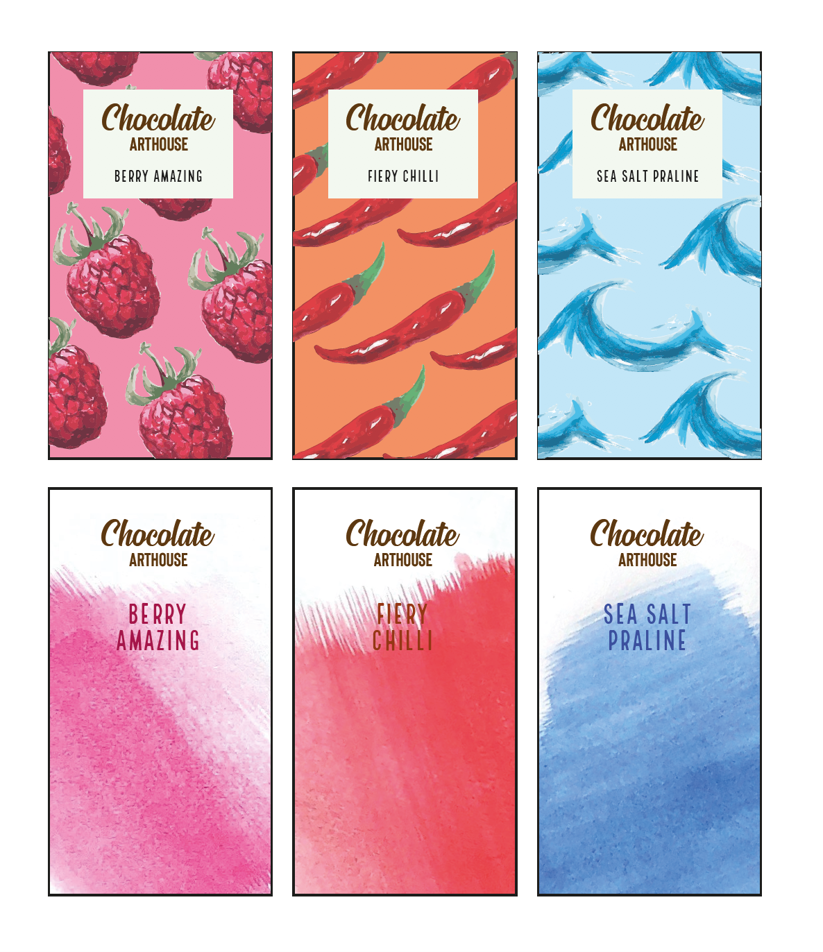
Art inspired ideas
Combining illustration with pattern
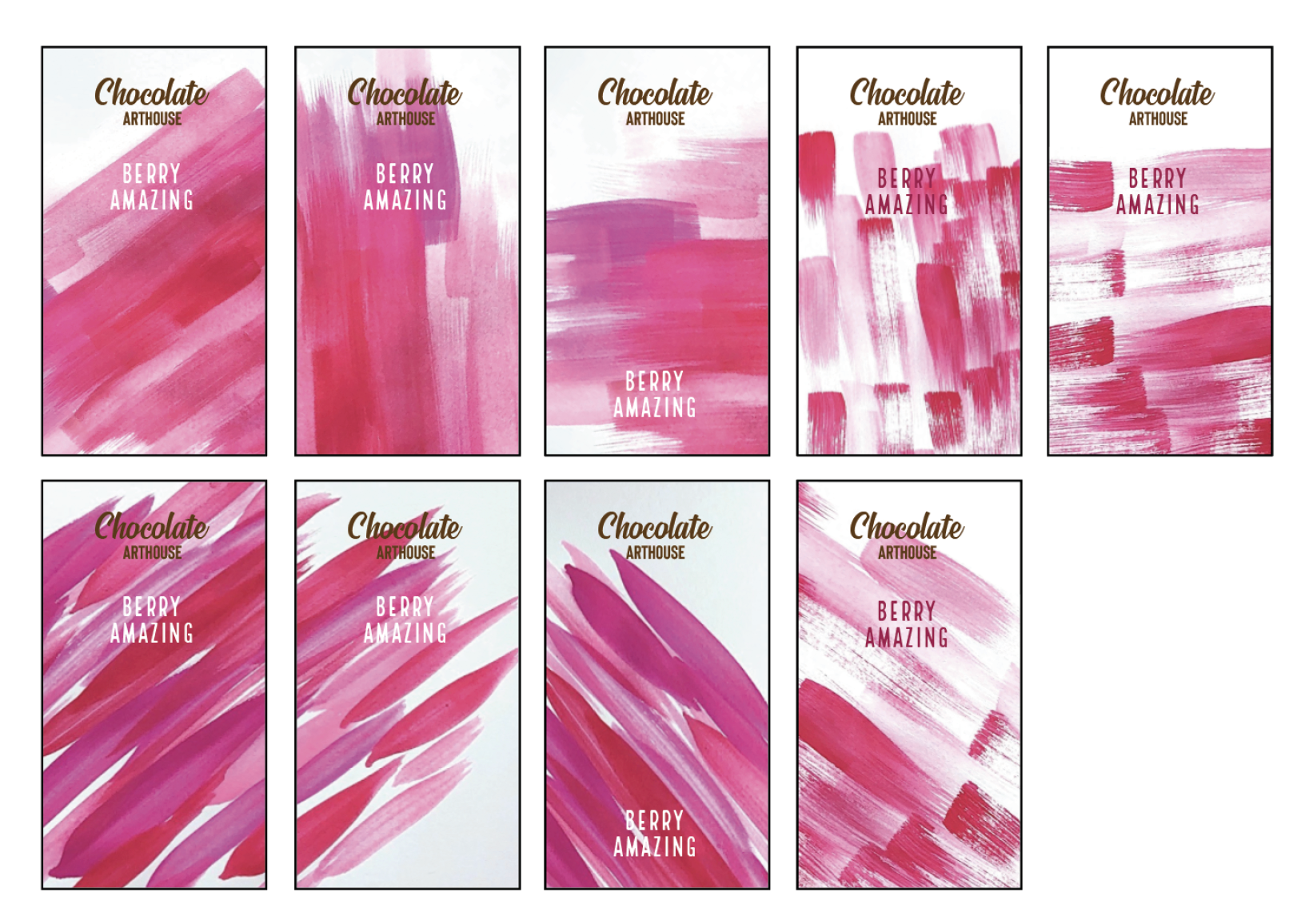
Experimenting with paint strokes
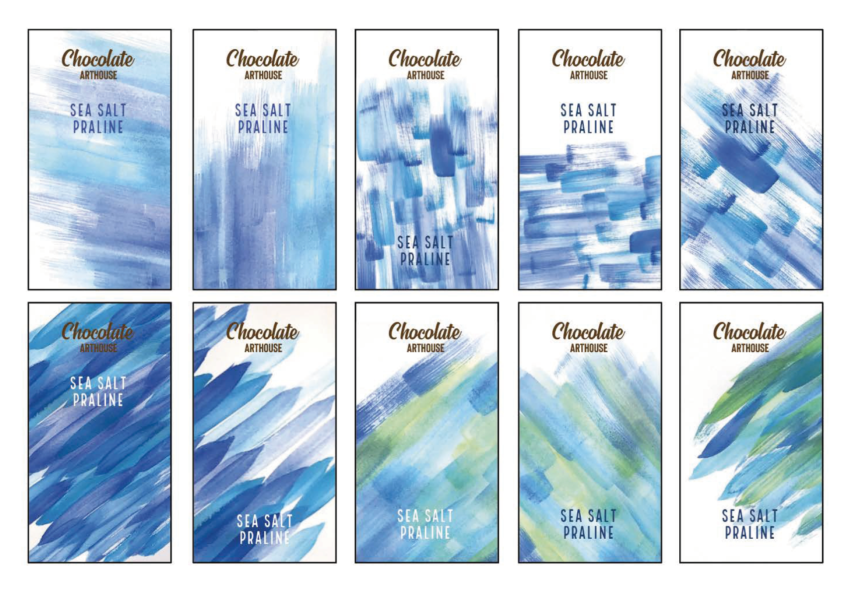
Experimenting with paint strokes

Final three bars crafted to scale

Inside of packaging with voucher

Inside of packaging with voucher

Back of packaging
Promotional video